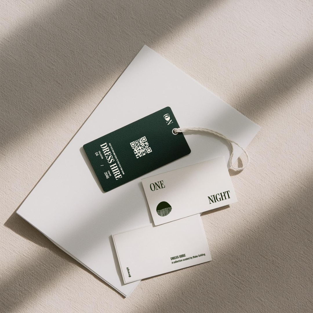
Dress hire branding for the woman who knows exactly how she wants to walk into the room.
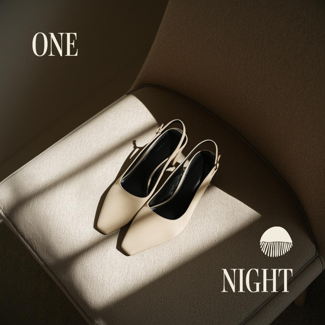
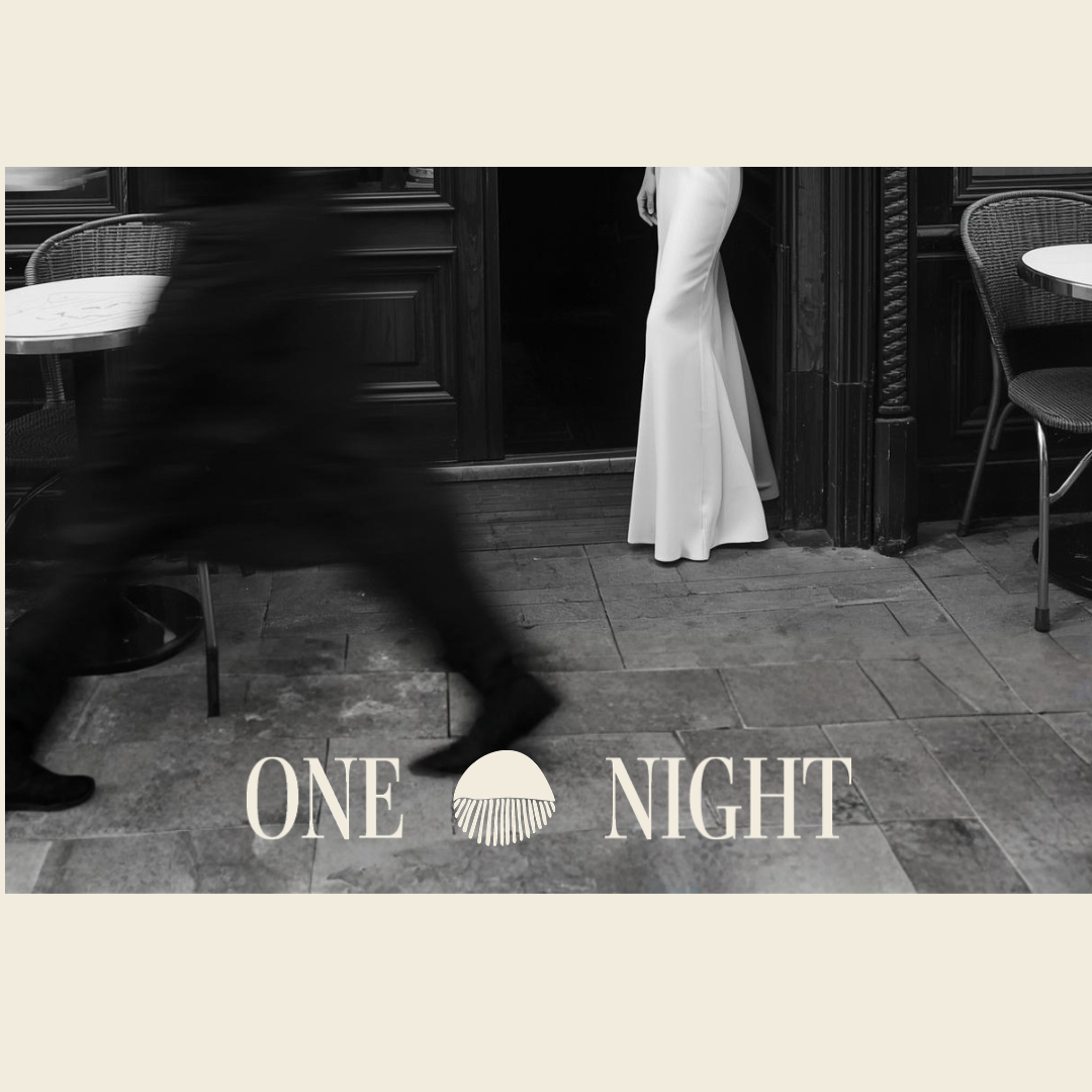
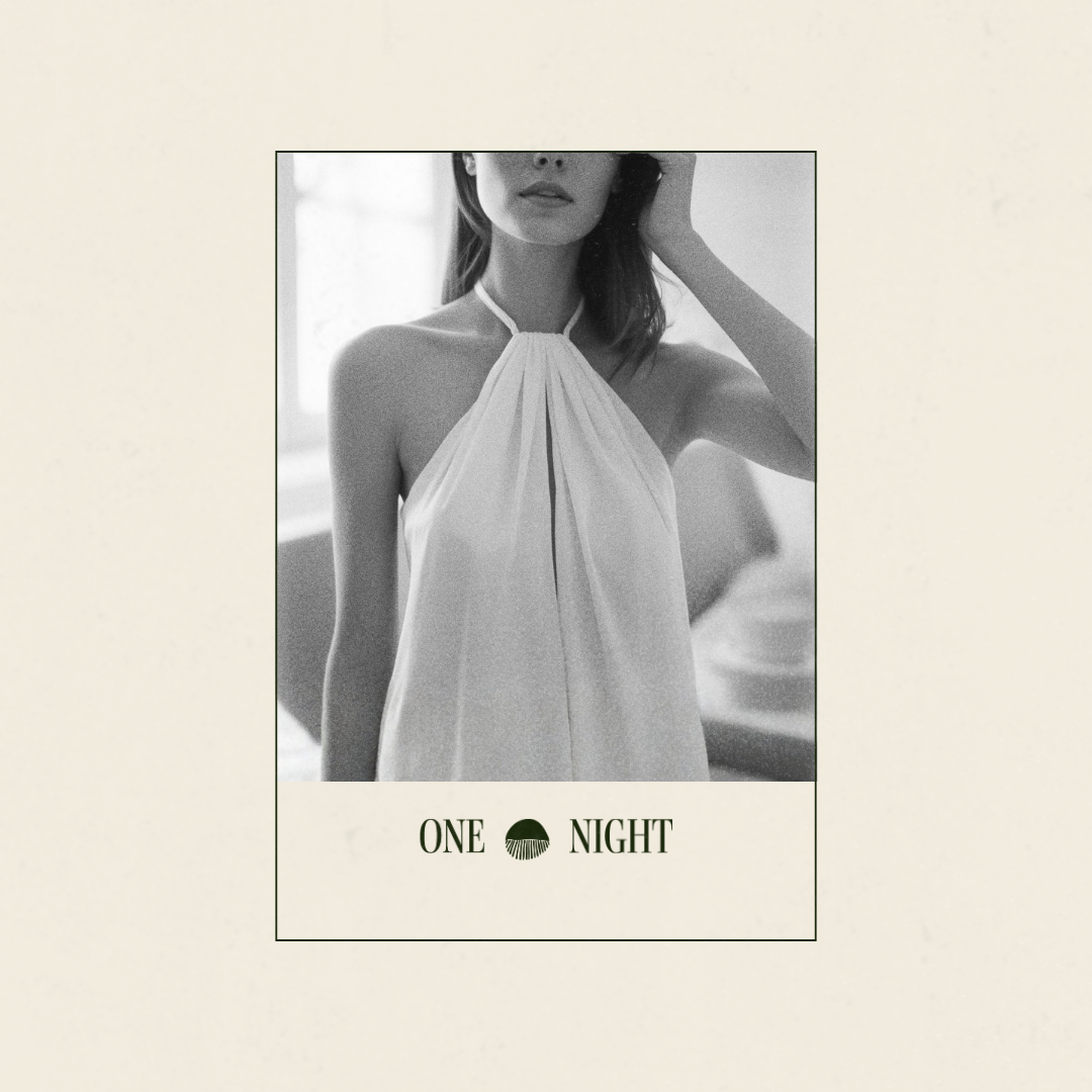

There's something about a font that does the talking before you even read the words. The main font brings a classic elegance that feels like it has somewhere to be. Paired with the clean and simple aesthetic of the paired sans serif, the two sit together the way a good outfit does. Nothing competing, everything considered.
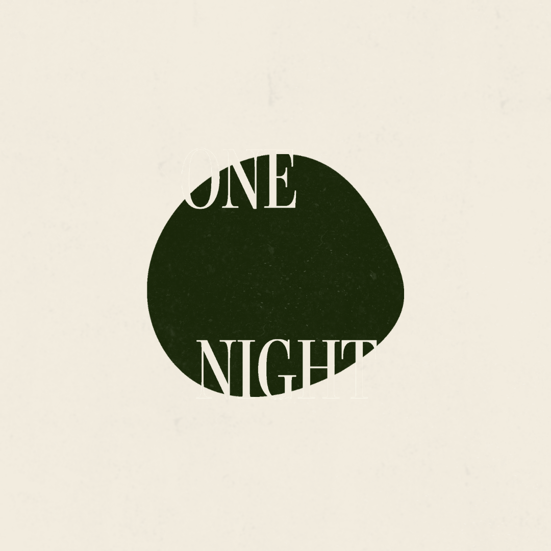
The colour palette came naturally. Minimal two tone colour palette of deep forest green with cream gives breathing space. The kind of colours that feel expensive without trying to tell you they are.
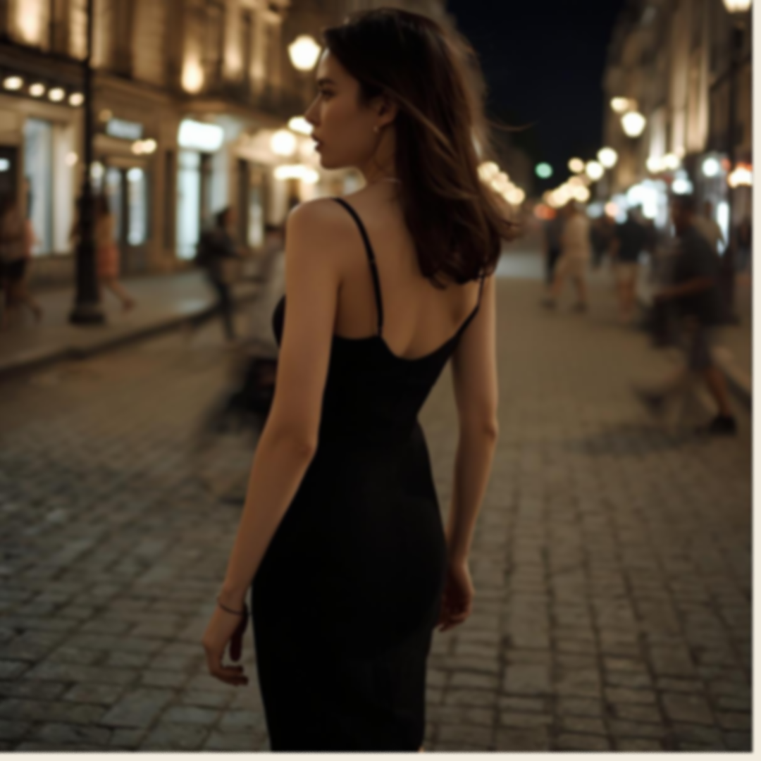
The photography direction leaned into black and white editorial, the shadows doing the work with light telling the story.
The icon is an eyelash flutter. Subtle, a little sultry, and completely what One Night feels like. Because a dress hire brand isn't really about the dress. It's about how you feel in it.
BRANDING / BUSINESS CARD / SWING TAG
As a passion project, this is a fictional client